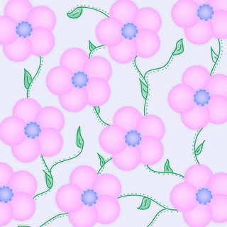
What do you think of this?
I was playing around with designing a pattern paper and below is what I come up with. Now here is where I need your input. Do you think this this is any good? Would you use something like this? Any constructive critisim is welcome. I'm not sure I am 100% happy with it so I am asking for some input. who knows I may even send you the file when im done if you leave me a comment answering my questions of giving some sort of feedback.
Thanks in advance.

Thanks in advance.


2 Comments:
Just surfing through blogs over at digiscrapdivas ;) If I were you, I'd try it with a white background...the greyish color is making it look a little too dingy or faded...but that's just my opinon :)
I agree with Jenn, Justine, a lighter (or maybe brighter) background would improve the gorgeous pattern. And if I may offer some more advice: texture! texture! texture! :) Hope this helps, Justine! {hugs}
Post a Comment
<< Home